
Woman lying awake in bed | Source: Shutterstock
The Worst Paint Colors for Your Bedroom, According to Designers and Sleep Experts
The color of your bedroom walls may be doing more than setting the mood. Experts say some shades can actually make it harder to relax and fall asleep.
Advertisement
The bedroom is your most sacred sanctuary. It’s where you spend most of your time relaxing and sleeping. That being said, the atmosphere in your bedroom should support that purpose. One major factor that contributes to that is the color of your walls.

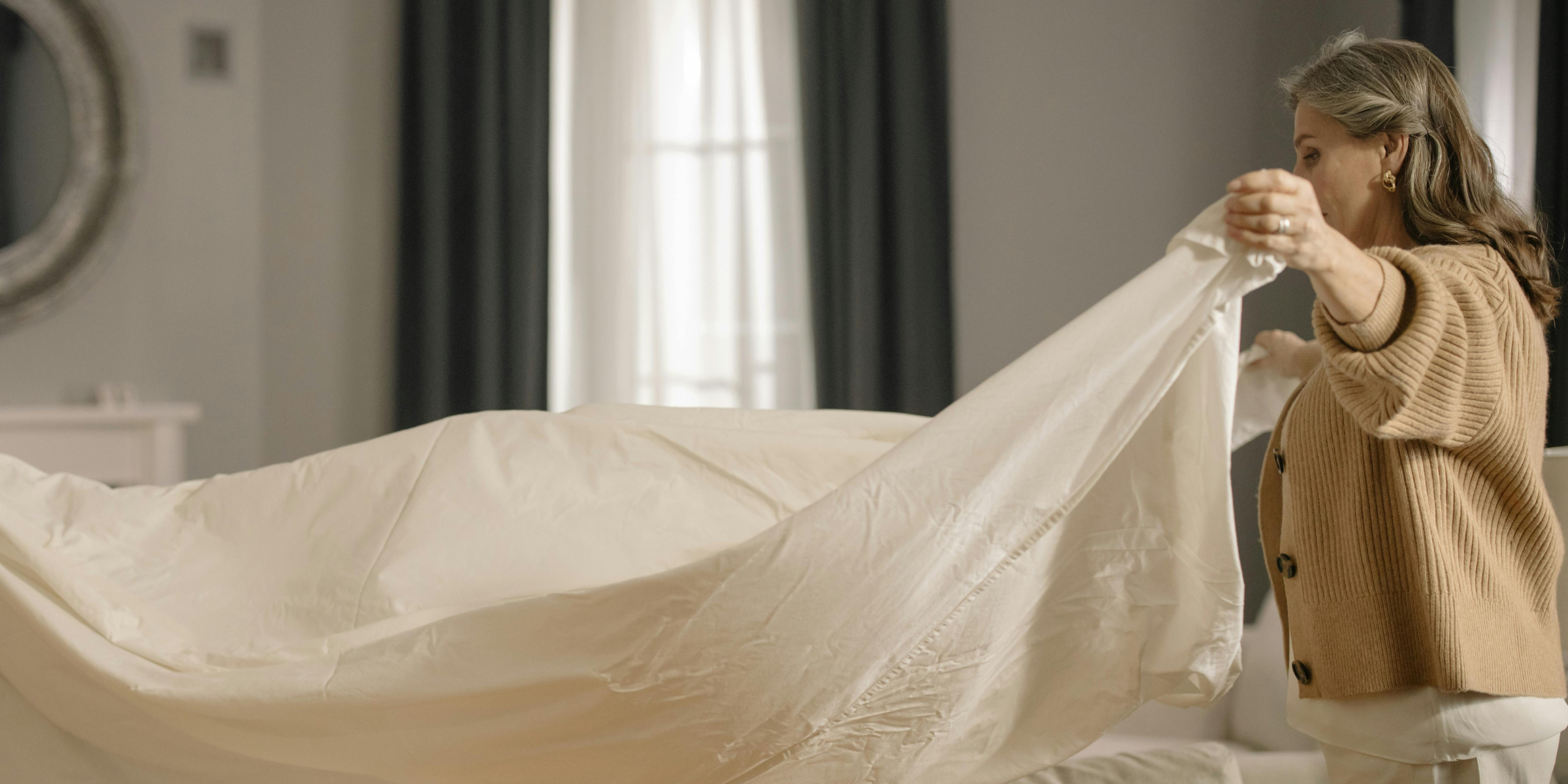
A woman sitting in bed | Source: Shutterstock
Choosing a bedroom paint color is not just about style. The shade on your walls can affect how you feel at night and when you wake up in the morning.
Designers say the bedroom should be the calmest space in the home, while sleep research shows that certain colors can influence mood, heart rate, and alertness.
Advertisement
Together, they point to a clear takeaway: some colors simply do not belong in a space meant for rest.

A master bedroom in dark colors | Source: Shutterstock
Red: Too Intense for Rest
Red is one of the most consistently discouraged colors, particularly bright red, which isn’t relaxing and can feel overwhelming, according to designers.
“You always hear that you shouldn’t paint a bedroom red because it’s not relaxing,” says Drew Michael Scott of Lone Fox. “I think you could get away with a muted deep burgundy or maroon, but fire engine red is definitely not ideal.”
Advertisement
Research supports this. Red is associated with fear, anger, and excitement, and studies suggest it can increase blood pressure and pulse rate. Its stimulating effect may promote aggression and have the opposite impact of what most people need before bedtime.

A bedroom with a bright red wall | Source: Shutterstock
Bright Yellow and Orange: High-Energy Hues
Yellow and orange are considered high-energy colors and are generally not recommended for bedrooms.
Designer Cathy Cherry says bright yellow “is proven to activate the brain, and therefore makes it harder to go to sleep.” Yellow is also linked to caution and warning signs, reinforcing alertness.
Advertisement
Sleep experts also note that warm colors like yellow and orange are stimulating and may not promote sleep as effectively as cooler tones. Orange, which combines red and yellow, carries the same intensity.

A bedroom with bright yellow walls | Source: Shutterstock
Stark White: Too Clinical
White may seem like a calming and safe choice, but some designers disagree. Lindsey Herod says bright white bedrooms can feel sterile “like a hospital,” making them more clinical than soothing.
Sleep research notes that white is associated with words like “peace,” “secure,” and “relaxed,” and may be less stimulating than more colorful rooms. But the overall effect still depends on how the space feels to the individual.
Advertisement

A predominantly white bedroom | Source: Shutterstock
Black and Dark Shades: Heavy Associations
Approach black with caution. Although darkness supports sleep, black walls carry strong associations with sadness, depression, anger, and fear. Other dark colors, such as brown, are often linked to anxiety and sadness.

A bedroom with dark walls | Source: Shutterstock
Advertisement
Why Color Matters for Sleep
“A bedroom should be the most calming space in the home, a place where your body and mind can fully shut down,” says designer Rayana Schmitz of Firefinish Interiors.

Sleep experts share a similar view. Research shows that color can affect your emotions, and your mood plays a role in how well you sleep. If you feel tense or overly alert before bed, it can be harder to fall asleep.
Our reactions to color are shaped by both instinct and experience. Over time, people begin to associate certain shades with stress, safety, comfort, or warning based on what they see in everyday life.

A man sleeping peacefully in a blue bedroom | Source: Shutterstock
Advertisement
Shade and intensity also matter. A deeper or more saturated color can feel heavier or more energizing, while lighter tones may feel softer. That’s why it’s important to think about not just the color you choose, but the exact shade.
In the end, the goal isn’t bold design — it’s better rest. Choosing a calming color can make a noticeable difference in how you feel at night and when you wake up.
Advertisement
Advertisement