A Colorful History: How Past Pantone Picks Set the Stage for 2026
Pantone’s new Color of the Year for 2026 is more surprising than it looks at first glance. To understand why, you have to look back at the colors that came before it.
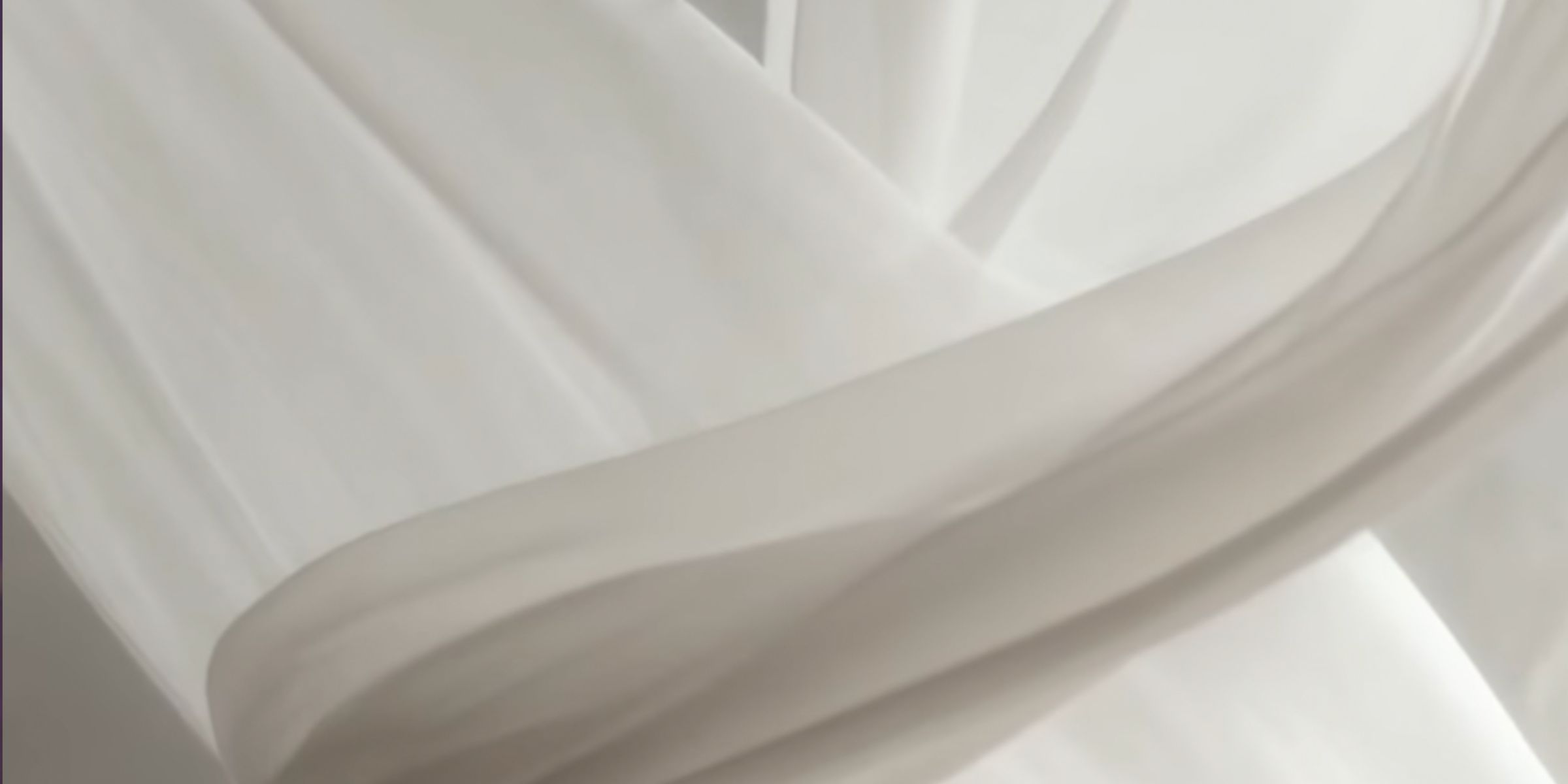
Pantone has announced its Color of the Year for 2026, and the choice is surprisingly simple: Cloud Dancer, that Pantone describes as “billowy white imbued with serenity.”
It’s a big moment for Pantone because this is the first time the company has ever picked white since it started naming a color of the year in 1999. (Source: TIME)
Pantone describes Cloud Dancer as having “an aerated presence” and acting as “a whisper of calm and peace in a noisy world.” The company says the color represents serenity and a sense of starting fresh.
Why Pantone Says This Color Matters Now
Leatrice Eiseman from the Pantone Color Institute explained the deeper meaning in the announcement. She said, “Pantone 11-4201 Cloud Dancer is a discrete hue offering a promise of clarity,” especially during a time when “the cacophony that surrounds us has become overwhelming.”
Pantone chooses each year’s color by looking at culture, design, travel, technology, and how people are feeling overall. Laurie Pressman, vice president of the Pantone Color Institute, said their team works almost like “color anthropologists.”
Looking Back: How Past Colors Set the Stage for 2026
To understand how Pantone arrived at Cloud Dancer, it helps to look at past colors. A list of every Color of the Year shows that Pantone often shifts between bold, energetic shades and softer, comforting ones.
Recent choices especially show a move toward quiet, soothing tones:
Mocha Mousse (2025) — picked for warmth and harmony
Peach Fuzz (2024) — described as gentle and nurturing
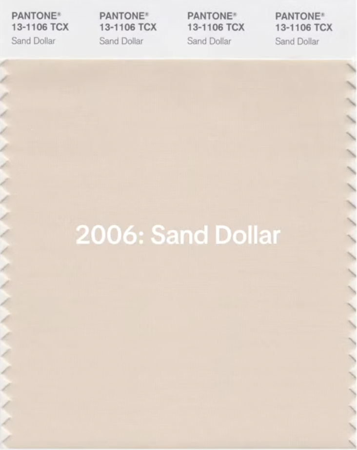
Pantone came close to choosing a white before. In 2006, Sand Dollar was selected, a neutral shade meant to reflect economic concerns. (Source: TIME)
This pattern makes Cloud Dancer feel like a natural next step. After several turbulent years, Pantone is pointing to calm, clarity, and the idea of a clean slate. An article on Time also notes the broader social unrest the U.S. has experienced, which helps explain why Pantone leaned toward a quiet, peaceful shade.

Pantone of the Year 2006 - Sand Dollar | Source: instagram/housebeautiful
Why Cloud Dancer Fits This Moment
Pantone says Cloud Dancer connects to our need for understanding and human connection. It’s not a flashy color. Instead, it feels like an invitation to pause, take a breath, and think about what comes next.
The color may be simple, but the message behind it is not. It reflects both where we’ve been and where many hope to go in 2026.
A Look Back: Pantone’s Full Color Timeline
Before we wrap up, it helps to see Cloud Dancer in the bigger picture. Pantone’s Color of the Year has been around for more than two decades, and each shade tells a small story about the mood of its moment.
Seeing them all together shows just how much cultural change, design taste, and global events have shaped the colors we remember.
2000: Cerulean
2001: Fuchsia Rose
2002: True Red
2003: Aqua Sky
2004: Tigerlily
2005: Blue Turquoise
2006: Sand Dollar
2007: Chili Pepper
2008: Blue Iris
2009: Mimosa
2010: Turquoise
2011: Honeysuckle
2012: Tangerine Tango
2013: Emerald
2014: Radiant Orchid
2015: Marsala
2016: Rose Quartz & Serenity
2017: Greenery
2018: Ultra Violet
2019: Living Coral
2020: Classic Blue
2021: Ultimate Gray & Illuminating
2022: Very Peri
2023: Viva Magenta
2024: Peach Fuzz
2025: Mocha Mousse
2026: Cloud Dancer
Whether you follow design trends or just enjoy seeing how color mirrors the world around us, Pantone’s 2026 pick reminds us that sometimes the quietest shades say the most.
